Art Guidelines
- These guidelines apply to all our art-making.
- These are our Minecraft-related technical guidelines.
- General tips and tricks, sizes, ratios, and how-tos.
- We are aiming to stick to a traditional Minecraft style.
- We want to promote creativity but do not go overboard on polys, voxels, rotations, number of cubes, etc.
- When making icons we also will be following the Minecraft icon art style.
- New block ideas also need to follow a Minecraft-inspired art style.
Main Guidelines
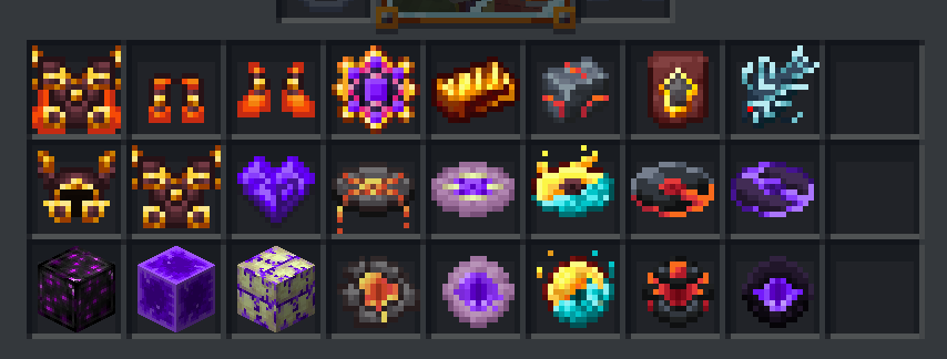
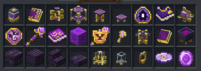
- 16 x 16 pixel ratio for all the artwork.
- Stay within the realm of Minecraft style.
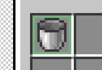
- Icons/sprites have a darkened border around them.
We should try to always keep this style aspect because it's what makes items look like they are in a Minecraft style. How dark the border is can be subjective, but I would refrain from using pure black. Many may not realize but even the darker border follows shading/lighting where the bottom sides are often darker to give a shadow effect.
Shading
It can be subtle or even a bit more contrasting.
Slot
A Minecraft item slot in almost all GUI containers like the inventory are all 16x16. Whenever possible we should strive to always keep a 1px space between items and the border of the 16x16 box.
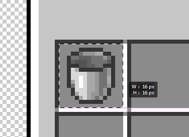
Here is an example of how it sometimes does not:
-
It's okay if small parts sometimes touch the edges, just try to refrain from having things touch edges as much as possible. (This only applies to items that will be in inventory - this does not apply to icons like abilities)
Simplify
Icons should be fairly simplified, but this does not mean that they should be flat or boring. This means that you should really try to simplify your drawing/idea as much as you can while still being able to convey what it is clearly to the audience. If you make overly complicated icons, the details can get lost or blend together when small - making it hard or impossible for viewers to understand what the item is.
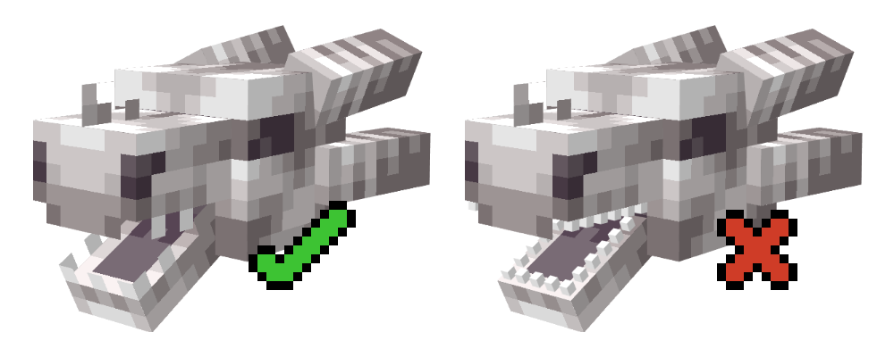
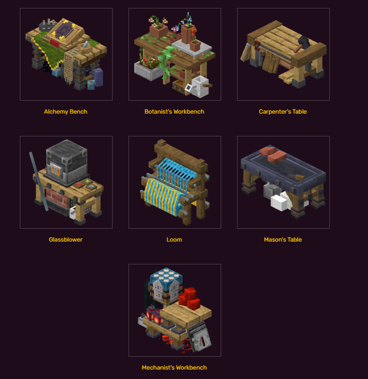
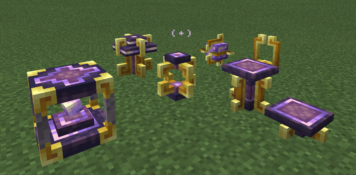
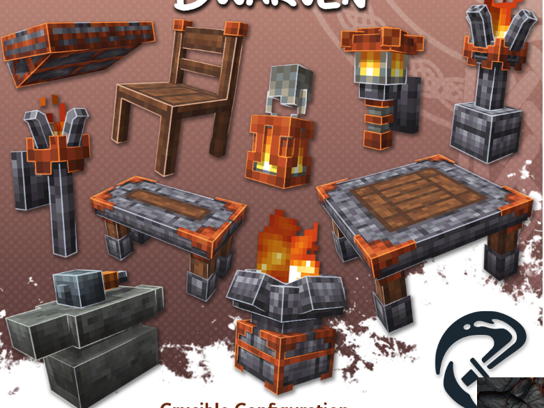
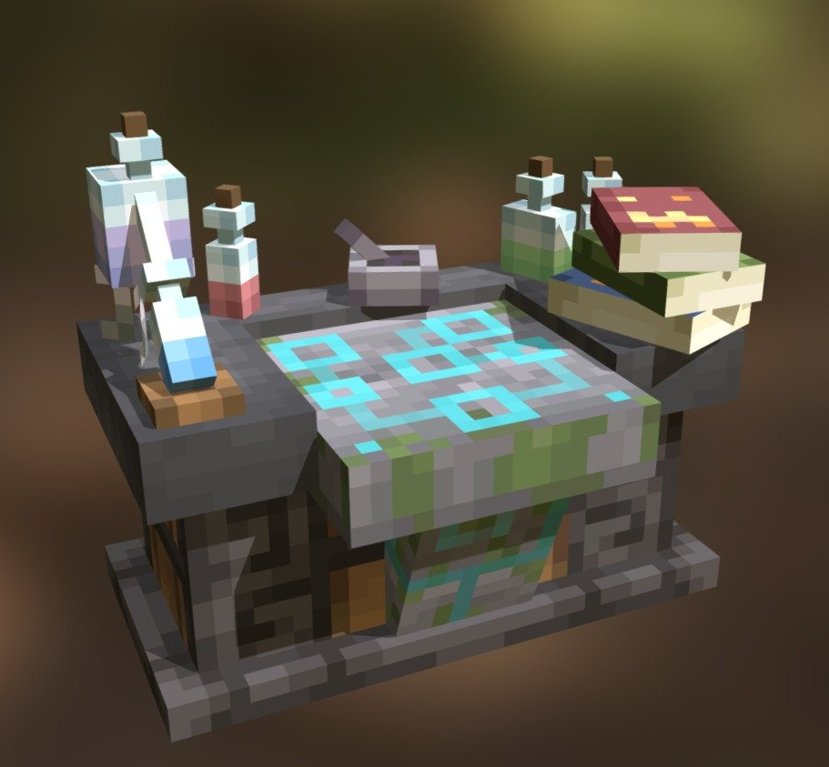
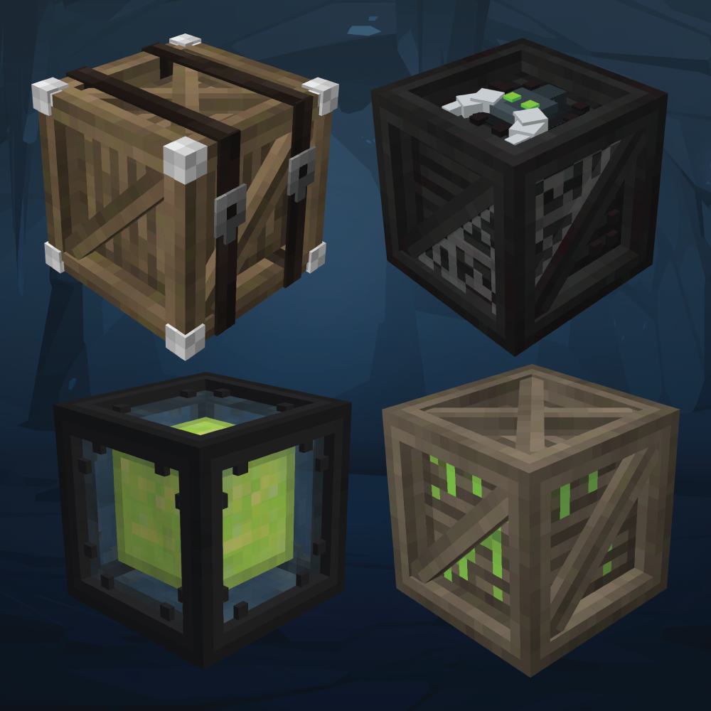
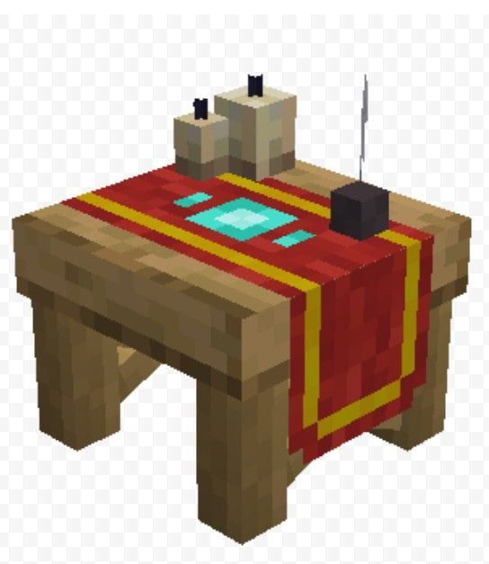
3D Objects, Workbenches, Etc.
- Keep 3D builds as simple as possible and let the texture do most of the heavy lifting.
- Try to use 0.5 or smaller measurements as minimally as possible. Using 1px polys/voxels and larger is totally fine. We ask that 0.5 and lower measurements be used very rarely, and only when absolutely necessary.
- No trying to make crazy circles or cylinders.
- Try to use full boxshading UV when possible (where the full texture map is on one .png file).
- Your file sizes can be larger like 64x64 but keep 16 pixel "look"/ratio on all designs.
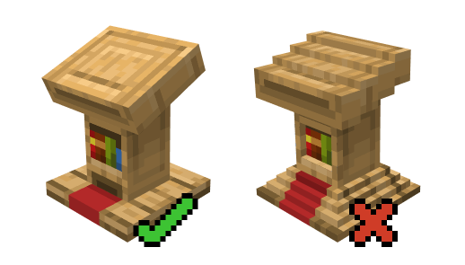
- Do not use too many shapes/voxels/polys for "details" when those details could be achieved with the texture.
- Try to be sparing with the number of polys/voxels.
- Most small objects like teeth and other details are usually flat and not full small voxels.
- 3D and block textures should also follow the 16x16 pixel ratio rule.
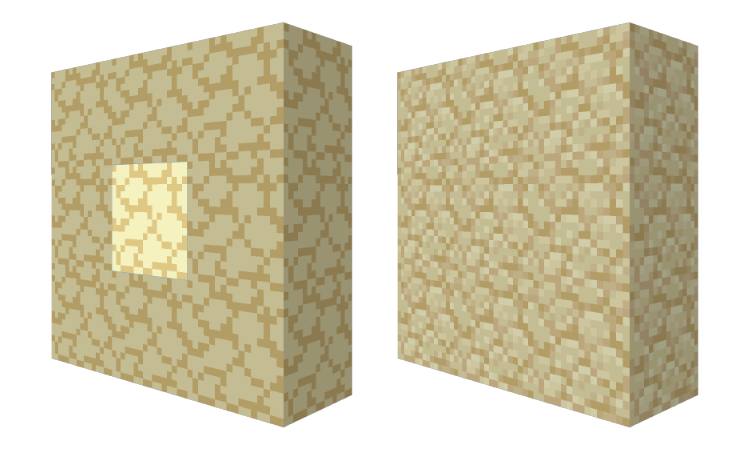
- Always make sure that the tiling of a block makes sense and doesn't create weird shapes or has a disconnected tiling effect.
- You typically want to be creating seamless tiles in most cases. Of course there are exceptions - and they are for a good reason.
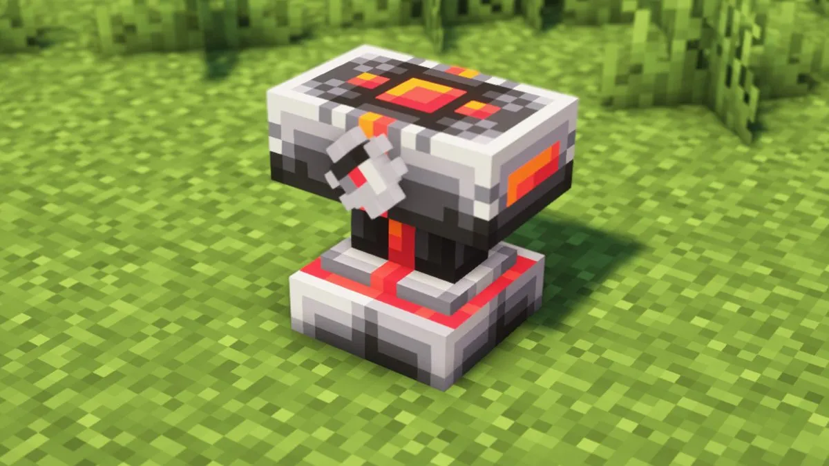
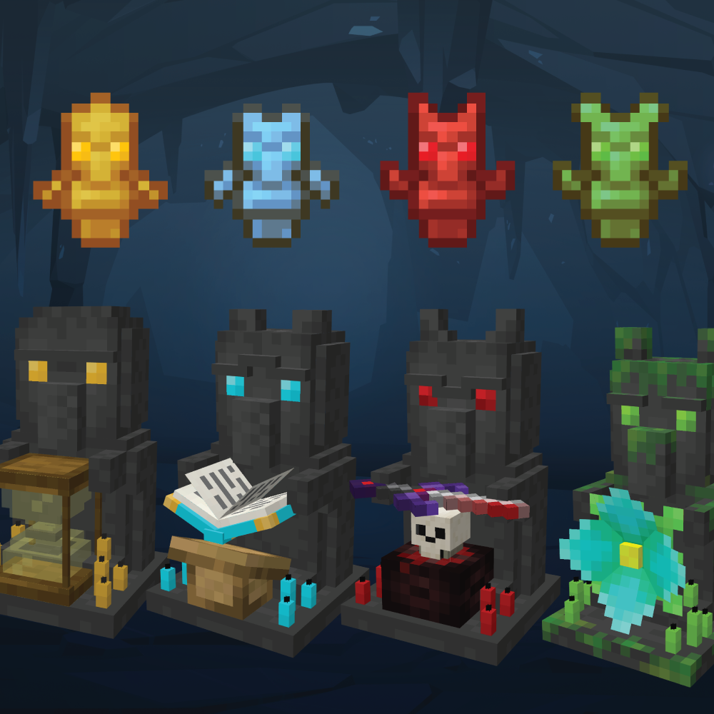
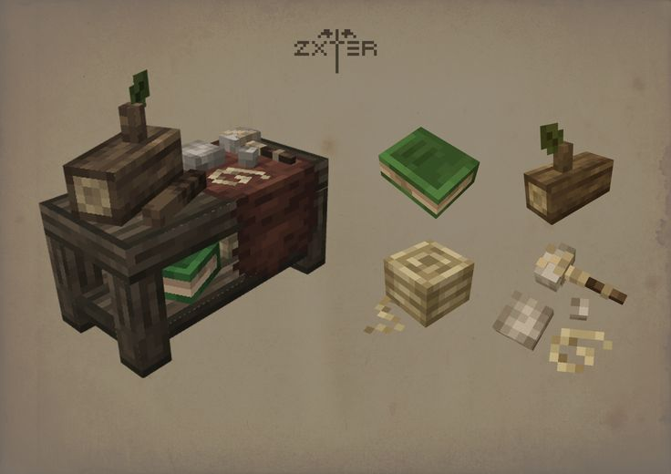
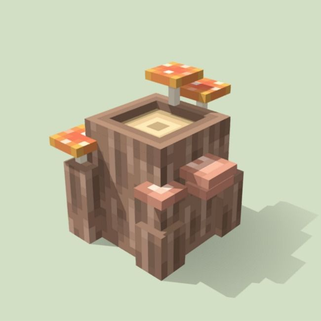
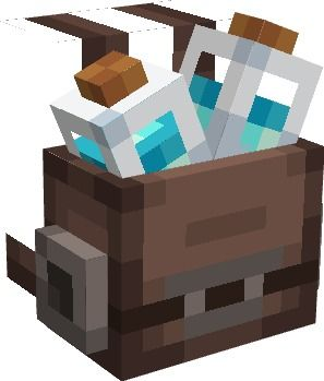
- 3D references and workstation examples
Special Exceptions
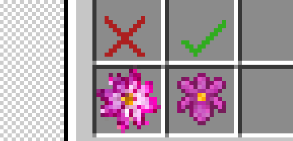
- Some items/designs have exceptions to the rules. Example:
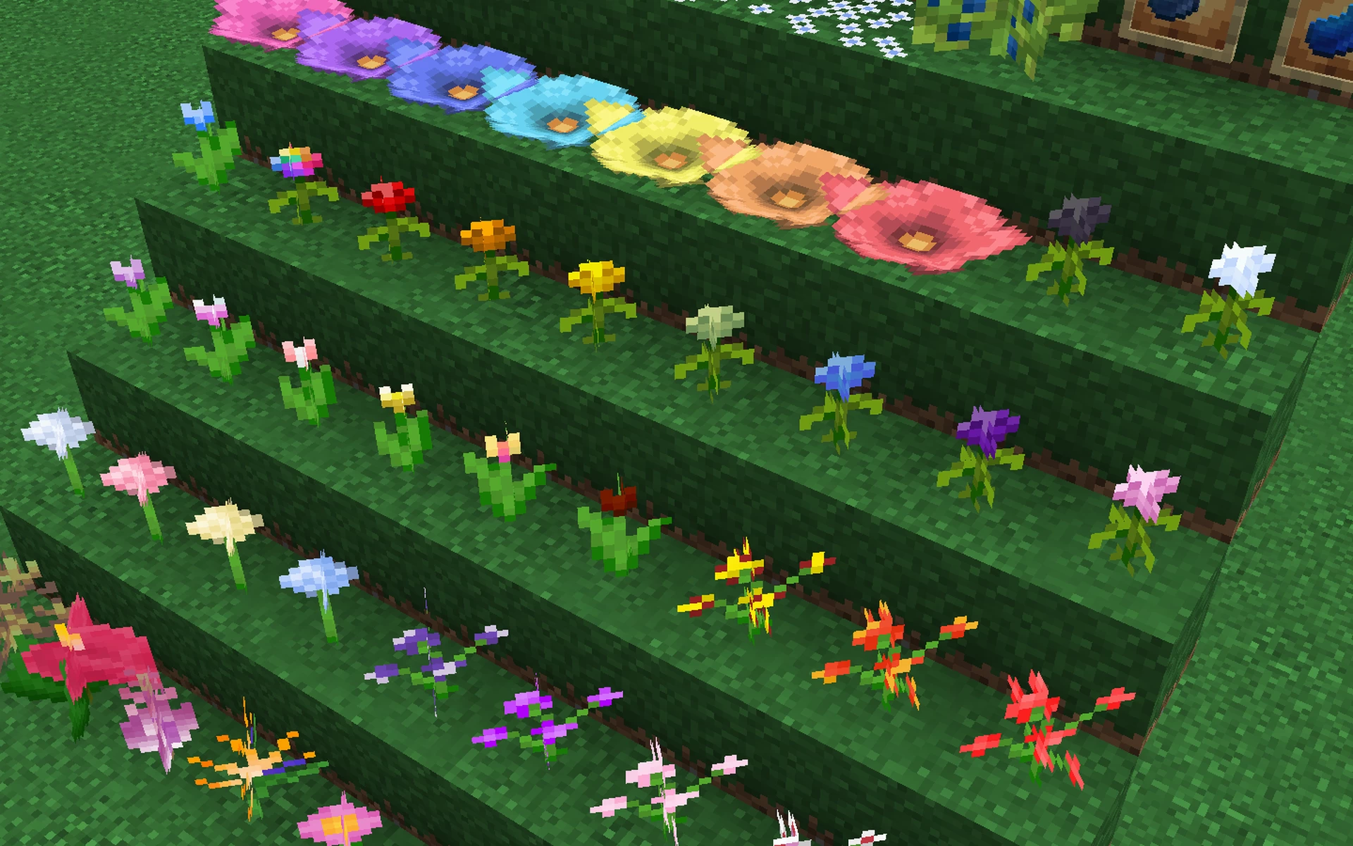
- Plants and flowers for example do not typically follow the darker border rule.
- Plants and flowers also do not typically follow the 1 pixel padding rule within the 16x16 frame.
- Plants and flowers also typically make a X crisscross when placed down 3D.
- Or they can also have different 3D designs like the spore blossom for example.
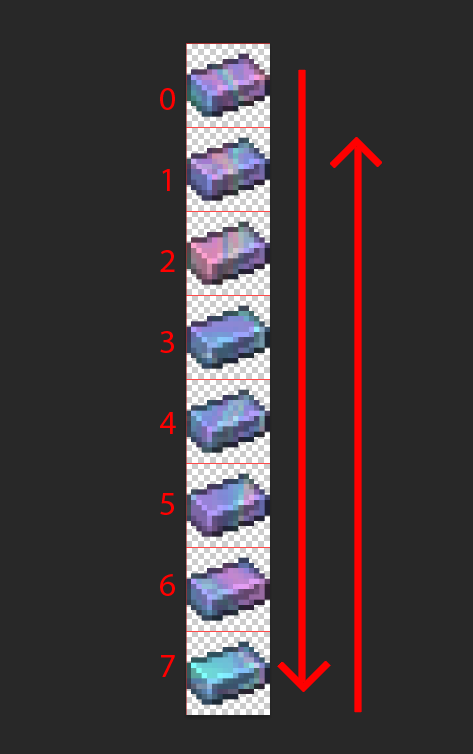
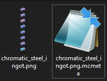
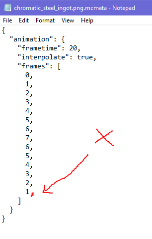
Creating Minecraft MCmeta Animations
- Minecraft animation on most items and block textures are done using MCmeta files and the code that tells Minecraft how to run the animation.
- You have to create a single file that is a vertical animation strip.
- Minecraft frames ALWAYS start with Zero 0 as the number for the first frame.
- Animation files always have a corresponding .mcmeta text file with the animation code.
- You can find out more about MCMeta files here: Minecraft Wiki
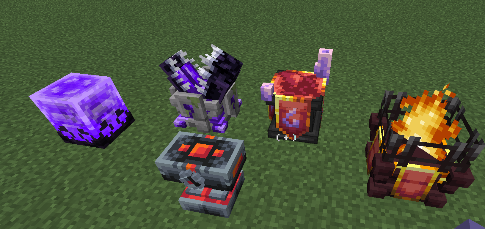
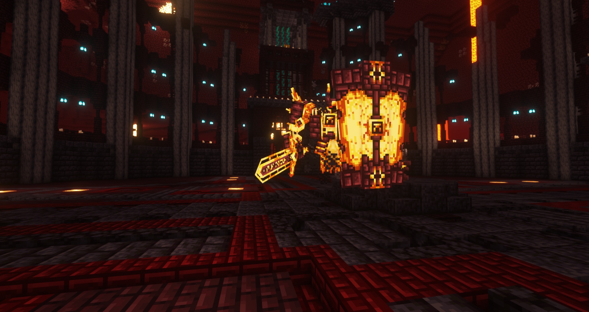
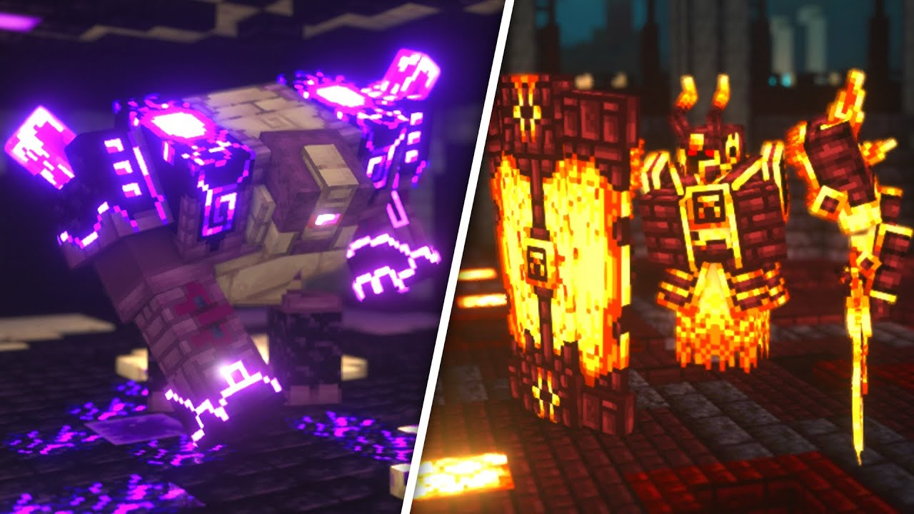
Following A Theme
We will be following a palette theme for a great majority of the work. There will also be some other theme sub-types that may be added later on, it's good to always to make sure your work stays on theme and follows the art directions, there are examples of how other mods stay "on-theme".
- Cataclysm Theme Example
- Ars Nouveau Theme Example
- Enllightened Mod Theme Example
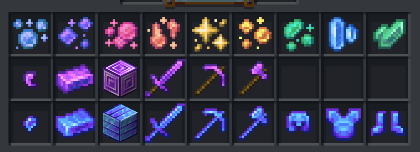
- Deeper and Darker Theme Example
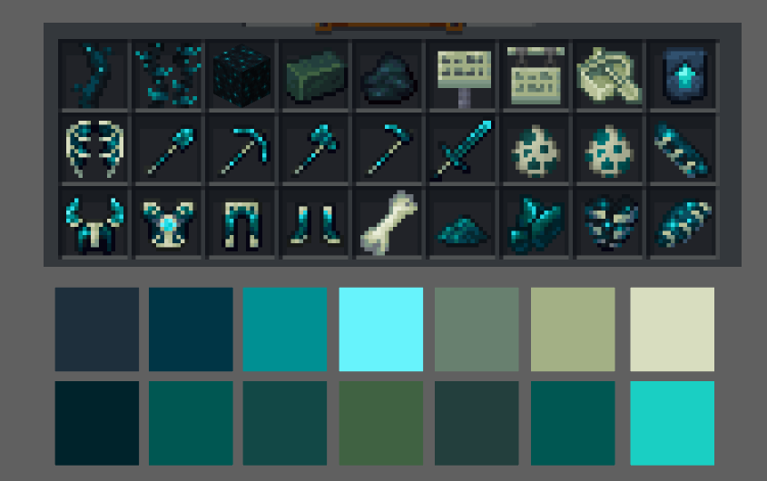
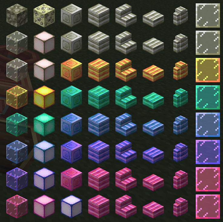
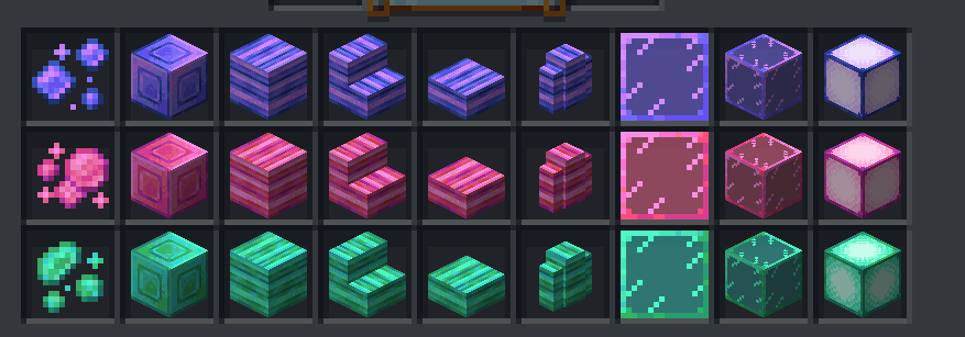
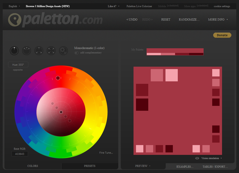
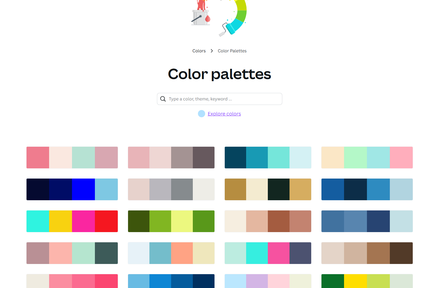
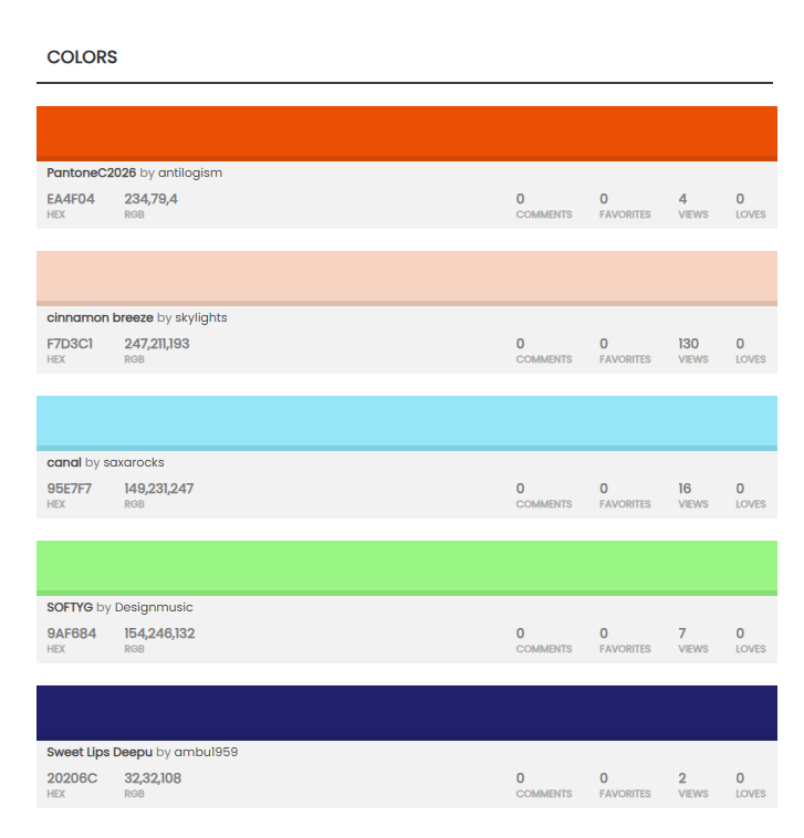
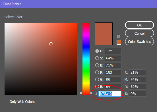
Color Schemes
GUI/Sprite Sheets
- When creating GUI sheets or sprite sheets it's best to make sure all your elements are not floating willy-nilly around in the artboard.
- You need to align the elements to the top-left side of the document as much as you possibly can (within reason).
- It is okay for elements to be next to each other or touching. You want to cut down on as much space between elements as possible.
- If you have a sprite sheet with a bunch of icons (like abilities) on it, then make sure each icon is contained how you wish it to show up, and the sprites are inside a grid that is evenly spaced.
Checking Items Against Minecraft Grey
- It's really important to check if your art assets work well against Minecraft grey like in the inventory and hotbars.
- It's best to work with that grey as your "paper color" or "background color" while working to help you see if your art has enough contrast against Minecraft grey.
- Minecraft grey hex code is around:
#8b8b8b

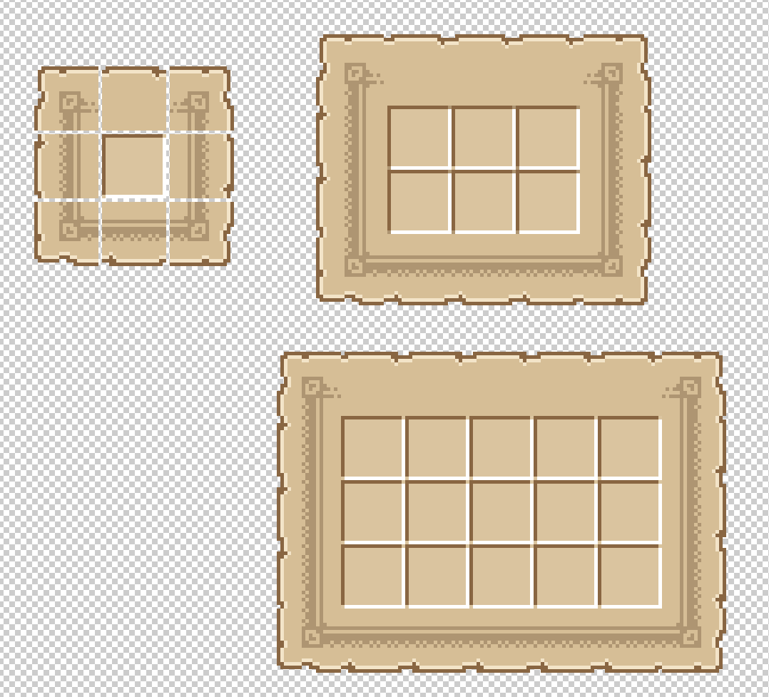
9-Slicing
- 9 Slicing is when you have a design that is sectioned into 9 pieces/slices to be able to be used in a repetitive manner for adaptive designs.
- Below is an example of 9-Slicing this inventory GUI design to be able to be as big or small as needed.
- Instead of creating all the pre-determined sizes, this gives us (basically) infinite possibilities.
- Some people do not like working with 9-slicing, nor is it something that should always be used (use when it makes sense to use it.)
- Each slice (usually) needs to be sliced into equally sized sections.
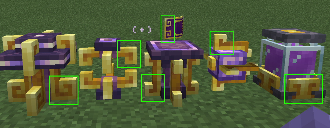
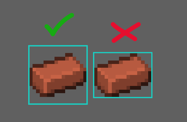
Complexity
- We don't want to go with anything too complex.
- As mentioned earlier we want to try to let texture do "most" of the heavy lifting whenever possible
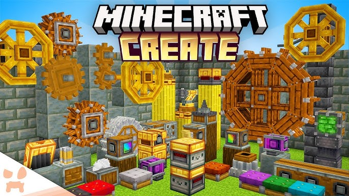
- In terms of complexity, here are some prime examples of how complex (rather how non-complex) 3D things should be
- Use as many normal cubes as possible and try not to create complex-gons like octagons, hexagons, pentagons, etc. (very rarely use)
- Here are some examples to help get an idea of our level of 3D model complexity
- This doesn't apply the /exact/ same way to weapons/armor/mobs but should be also taken into consideration when making those.
Exporting Artboards
- Make sure you export the item inside and with the artboard size.
- Item sprites need to be exported as a full 16px x 16px file.
- Item sprites should be exported with transparent backgrounds.
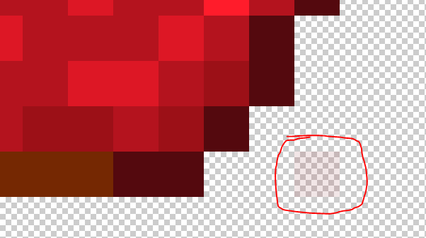
- Opacity on items doesn't work the way you want it to.
- Low-opacity spots tend to render at full opacity (unless dev coded for that effect).
- This low opacity red pixel would render full opacity in-game.
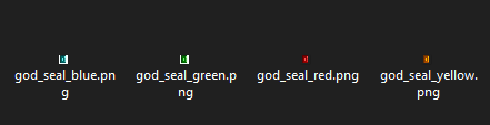
Naming Art Asset Files
- ALL art file names in Minecraft must be in lowercase.
- Art asset file names should NEVER include spaces and should always use underscores
_in place of spaces. - If working on a group of items that are the same item type, but have a different variation always make sure to include the item type+variation in the naming. Example:
- ability_fireball.png
- ability_iceshard.png
- ability_bolt.png
- ability_dash.png
Also name your layers and groupings and such in Blockbench with lowercase letters and underscores in place of spaces, this will be a great help to the devs, because if you don't do this then they have to spend extra time renaming all your assets/layers/etc.
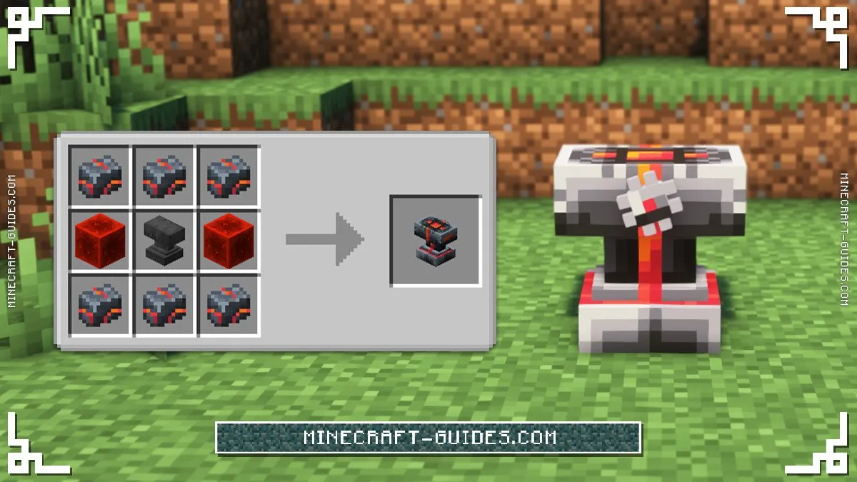
Design Inspo Based On Recipes